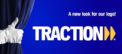
Traction, a leader in the Canadian heavy-duty aftermarket sector, has updated its iconic logo.
The company says its new logo has been updated to match the colors of NAPA, and better fit within UAP company. The company says part of the famous nut making up the NAPA logo has been included in the two arrows of the new Traction logo. These arrows represent in particular the transport industry, the dynamism of the team as well as the strategic vision pointing towards the future.
This change also is in line with recent logo changes for UAP three years ago and NAPA last year, aiming to remain current, modern and refined to meet the demands of today's market, the company adds.
"After celebrating our 60 years of success at Traction, it is during this 61st year that Traction has renewed its brand," says Alain Primeau, executive vice president of UAP Heavy Vehicles. "It is with great enthusiasm and pride that we present to our new logo. This logo combines with distinction the rich history of Traction as well as the great notoriety of the NAPA brand. It strengthens the synergy within the large UAP family and will propel us towards another 60 years of excellence."
The company also notes the change of logo marks a new stage in the history of Traction, thus reinforcing its commitment to its customers, employees and partners while positioning itself as an innovative leader in its sector.


